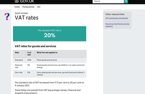
GOV.UK wins Design of the Year 2013
The website GOV.UK has won the Design Museum Design of the Year Award 2013.

The site, designed by the Government Digital Service, combines all of the UK government’s websites into a single domain. The winning design was chosen from 98 entries to claim the overall prize after winning the digital category.
Nick Hurd, Minister for Civil Society, accepted the award which was presented at an awards reception held at Angler, South Place Hotel, London.
The jury unanimously agreed that GOV.UK was the overall winner for Design of the Year 2013 for its well thought out yet understated design, making the user experience simpler, clearer and faster. The website is regarded as one of the leading government websites in the world.
The Rt Hon David Cameron MP, Prime Minister and Conservative Party Leader said:
I am delighted that the GOV.UK website has won the Design of The Year award in 2013. This government is committed to being the most transparent in the world. For the first time, people can find out what’s happening inside government, all in one place, and in a clear and consistent format. It is just another example of Britain’s world class design talent standing out on the global stage; in this case helping to enhance the modern relationship between the public and government.
Deyan Sudjic, Director of Design Museum added:
GOV.UK is a remarkable success on so many levels. It makes life better for millions of people coping with the everyday chores, from getting a new passport, to paying their taxes. It’s a reflection of the government understanding how to communicate with the country in a way that works, it’s simple, direct, well mannered, all the things that we would like to take for granted from the government, but in a sea of red tape and jargon, usually can’t.
GOV.UK looks elegant, and subtly British thanks to a revised version of a classic typeface, designed by Margaret Calvert back in the 1960s. It is the Paul Smith of websites. The rest of the world is deeply impressed, and because it has rationalised multiple official websites, it saves the taxpayer millions, what’s not to like?
Design of the Year jury member Griff Rhys Jones commented:
It is an extremely complicated task to look through such a vast array of design and decide upon one winner. You end up with arguments for and against all the nominations but in the end GOV.UK was a clear winner. It’s a vote of confidence to the idea that the government can lead the way with simple and clever design. It creates a benchmark for which all international government websites can be judged on.
GOV.UK and the other shortlisted designs are currently on show at the Designs of the Year exhibition at the Design Museum, London until 7 July.
Notes to editors
Previous Design of the Year winners:
- Design of the Year 2012 - London 2012 Olympic Torch, designed by Edward Barber and Jay Osgerby, commissioned by LOCOG
- Design of the Year 2011 - Plumen 001 Light bulb - Samuel Wilkinson and Hulger
- Design of the Year 2010 - Folding Plug - Min-Kyu Choi
- Design of the Year 2009 - Barack Obama Poster - Shepard Fairey
- Design of the Year 2008 - One Laptop Per Child - Yves Béhar
The Designs of the Year 2013 jury:
- Johanna Agerman Ross (editor of Disegno)
- Amanda Levete (architect)
- Olga Polizzi (director of Design for Rocco Forte Hotels)
- Sarah Raven (garden designer)
- Griff Rhys Jones (actor and presenter)
- Nicolas Roope (designer)
- Ilse Crawford (designer) – chair of the jury