Working paper 3. Long-term Air Quality Statement (LTAQS)
Updated 10 June 2025

© Crown copyright 2025
This publication is licensed under the terms of the Open Government Licence v3.0 except where otherwise stated. To view this licence, visit nationalarchives.gov.uk/doc/open-government-licence/version/3 or write to the Information Policy Team, The National Archives, Kew, London TW9 4DU, or email: psi@nationalarchives.gov.uk.
Where we have identified any third party copyright information you will need to obtain permission from the copyright holders concerned.
This publication is available at https://www.gov.uk/government/publications/advice-given-to-the-air-quality-information-system-aqis-review-steering-group/working-paper-3-long-term-air-quality-statement-ltaqs
Summary
A focus on providing information to the public based on the likely effects of short-term exposure (the Daily Air Quality Index (DAQI)), could lead to a lack of understanding, among the public, of the public health burden of long-term exposure to air pollution. Recognising this, the Committee on the Medical Effects of Air Pollutants (COMEAP) AQIS working group was asked to consider how a long-term air quality index (LTAQI) might help address this gap. An early conclusion of the group was that the provision of information on long-term pollutant exposure required consideration of issues additional to those that might be incorporated into a numeric index similar to the DAQI. Attention then moved from description of a LTAQI to consideration of a Long-term Air Quality Statement (LTAQS). Focus shifts accordingly from LTAQI to LTAQS as the paper progresses.
This paper is set out in 2 sections. Section 1 provides initial reflections from the COMEAP AQIS Sub-group on what a possible LTAQI or LTAQS might look like. This section discusses factors that might need to be considered within a LTAQI or LTAQS, such as relevant stakeholders, pollutants included, geographic scale, data requirements and information on outdoor and indoor air pollution. The section outlines a number of possible options for a LTAQI/S and discusses advantages and disadvantages of each. Presenting annual concentrations of key pollutants in comparison with legislative limits and other standards or guidelines (option 3) was suggested as the most appropriate basis for an information system, together with signposting advice on how to reduce emissions of air pollutants. This is best regarded as a LTAQS, as it does not involve converting concentrations into another (index) scale.
Based on these observations, a draft LTAQS underwent testing by a panel drawn from the general public. This indicated that simpler formats were needed to display the air pollution concentrations, although some users would appreciate access to detailed information. Section 2 reflects on the feedback received from the panel and suggests changes to the initial draft LTAQS. Discussion in this section includes the possible provision of multiple layers of information, which people could choose to access, depending on their interest in and knowledge of air quality and what they intend to use the LTAQS for.
Section 1: Reflections on a Long-term Air Quality Index
Introduction
Air pollution risks are best quantified on the basis of long-term (annual) exposure to air pollution (Committee on the Medical Effects of Air Pollutants (COMEAP), 2023). Air Quality Indices (AQIs), however, are currently provided only on the basis of short-term average concentrations (the Daily Air Quality Index (DAQI)) by UK governments. Long-term indicators providing some synthesis of information beyond concentration data have not been identified for other regions.
This Working Paper considers the possible development of a Long-term Air Quality Index (LTAQI), structured around the following questions:
- What does the existing DAQI look like?
- What would be the underpinning philosophy for a long-term equivalent to the DAQI?
- Who are the relevant stakeholders for a LTAQI?
- What pollutants should it cover?
- What qualifies as ‘long-term’?
- What is the appropriate geographic scale for a LTAQI?
- What sources of data are available?
- What would a LTAQI look like?
- Would it have any disadvantages?
There has been information on long term outdoor concentrations at home addresses in the public domain, for example via the previously available ‘address pollution’ website (discussed below) which provided an index based on annual average concentrations. We discuss this approach below, and also consider whether there are better ways to communicate information on long-term air pollution risk.
What does the existing DAQI look like?
The underpinning objective of the short-term (Daily) DAQI is to provide sensitive, or otherwise interested, individuals with information that they can use to adjust behaviour on a daily basis if they are likely to be affected by short-term fluctuations in air quality. Decisions have been taken to provide information for several pollutants on a single numeric scale from 1 (low pollution) to 10 (very high pollution) with a colour scale alongside from green to purple, together with advice linked to the 10 levels, from enjoying usual activities when the DAQI indicates low pollution levels to taking increasing levels of precaution as pollution worsens. Guidance on using the DAQI is based on the following 3 steps:
- determine whether you (or your children) are likely to be at-risk from air pollution
2. if you may be at-risk, and are planning strenuous activity outdoors, check the air pollution forecast
3. use the health messages supplied corresponding to the highest forecast level of pollution as a guide
Once users understand how the system works they can complete a check on pollution conditions for their locality in a few seconds and take appropriate action if necessary.
What factors define the underpinning philosophy for a LTAQI?
The following is not intended, at this stage, as a definitive list of relevant factors, but the LTAQI should:
- provide a different perspective to the DAQI or to other tools and sources of information that are already available
- provide sound guidance based on current scientific understanding as reflected by the opinion of COMEAP, the World Health Organization (WHO), or some other respected body
- provide interested parties with validated information on air quality in a transparent format that is understandable by non-experts - communications experts should be involved in the design of a system whether it is very simplified (as the DAQI) or not
- cover pollutants for which risks have been linked to long-term exposure
- provide a basis for people to campaign for cleaner air in their street, and to hold government and major polluters to account
- provide some linkage to UK legislated limits, WHO Guidelines (2021) or other standards, as a failure to provide this linkage will be an obvious omission
Initial questions to consider include: is it appropriate to reduce the LTAQI to a single figure that is similar to the DAQI? This simplification may give instant impact, but make the system harder to understand. Whilst a concise format may well be desirable, too concise a format will leave many questions unanswered. A longer format than the instant reading provided by the DAQI should not be ruled out given that the LTAQI would not change every day (possibly only yearly).
A further important question concerned whether indoor exposure should be covered. As outdoor levels come down (recognising the effects of agreed legislation and measures that will be necessary to meet Net Zero carbon emissions), indoor pollution levels become more important, not least because UK residents spend most time indoors, often with inadequate ventilation. It is accepted that indoor levels of some air pollutants, for example radon, tobacco smoke and CO, can pose significant risk. Further to this there are significant indoor sources (for example, cooking and heating) of the key outdoor pollutants, PM and NO2, that will not be reflected in estimates of ambient (outdoor) levels. Provision of indicators in a form that provides guidance on short- and long-term outdoor concentrations but does not acknowledge indoor exposure would thus be incomplete and, for many, potentially misleading. Individuals who are concerned about the effects of poor quality air on themselves and their families should not focus only on outdoor air. Some form of inclusion of indoor pollution is clearly important to provide balance, even given problems of data availability.
Who are the relevant stakeholders for the LTAQI?
Those experiencing and managing exposure and impacts, for example:
- the general public
- health care providers
- schools
- care homes
- other sites where people spend a significant amount of time, including the workplace
Those with an interest in the outcomes, for example:
- general public
- non-governmental organisations (NGOs)
- industry
- motoring organisations
Those who can do something about emissions and impacts, for example:
- central government
- local authorities, including planners working on the sites of establishments where sensitive groups may congregate (for example, nurseries, schools and care homes)
- housing providers
- central government agencies
- industry and other businesses, motoring organisations and the general public (for example, reducing personal emissions)
What pollutants should a LTAQI cover?
As a minimum it would be necessary to provide information on outdoor levels of PM2.5, NO2 and O3.
Other regulated pollutants could be added to the list (toxic metals, SO2, CO, PAHs, benzene) . The need to extend the list in this way would be dependent on whether additional pollutants are considered to be present anywhere in the UK at air concentrations that suggest significant added risk to the population. ‘Air concentrations’ are stressed here, as inhalation is not the main exposure route for all harmful pollutants emitted to air. Exposure to dioxins and mercury, for example, is principally mediated through diet, with pollutants emitted to air being deposited to land or water and then entering the food chain. Inhalation exposures are typically very low, in the region of 1% (or a few percent) of overall intake (Rabl and co-authors, 2014). Inclusion of substances where inhalation represents a very minor source of exposure seems an unnecessary complication. Those wanting reassurance that emissions of these pollutants are being regulated can consult the time series of the National Atmospheric Emissions Inventory. Dietary exposure to many substances is subject to regulation.
Note: the availability of data is clearly relevant to considering the pollutants to cover and is considered in ‘Possible sources of pollution data’ below.
As noted above, the indoor environment includes exposure not only to the major outdoor pollutants but to others with significant indoor sources or the potential to accumulate in less-ventilated situations (radon, tobacco smoke and CO being good examples). However, data is not available for providing a quantified indicator for indoor air quality for a national tool, recognising that this will be a function not only of outdoor concentrations but also indoor sources of pollution, building design, behaviour of building occupants, the way a building is used, ventilation, and maintenance. Adjacent buildings of identical design will often have very different levels and types of pollution indoors. The indoor environment is thus too variable to be addressed using an indicator that could easily be collated at a national level and integrated with a quantified index for outdoor pollutants. For reasons discussed elsewhere in this paper, however, complete exclusion of the indoor environment is not desirable.
What qualifies as ‘long-term’?
In the case of the DAQI, concentrations are based on a maximum length of 24-hour (daily) averages. Therefore initially, it was contemplated that any averages longer than daily concentrations could be considered as ‘long-term’, these could be:
- weekly
- monthly
- seasonally
- yearly
- 2, 3 or 5-yearly
Note: the US EPA Integrated Science Assessments regard exposures of hours up to 1 month as short-term, and 1 month to years as long-term.
However, the shortest timescales would not provide clear messages that are distinct from existing daily assessment. ‘Yearly’ would reflect the timeframe used for most impact quantification work, key legislated objectives and WHO guidelines. ‘Seasonally’ could be useful where there are significant differences in pollutant exposure across the seasons such as for ozone, though this is rather confounded by the variability of the British climate. The longer time scales (multi-years) would allow interannual variability in climate to be averaged out, providing better consistency, though the reasons for adjusting data in this way could be wrongly interpreted.
Given the link to information on quantification, an annual indicator seems most appropriate for outdoor PM2.5 and NO2. Seasonal metrics, such as a mean value for the summer months, or for a period of half a year, may be appropriate for ozone.
It is also necessary to consider whether to provide long-term indicators for a fixed period (for example, calendar year) or on a running-mean basis. A fixed period seems better, to facilitate provision of supporting information, indicating for example if weather conditions for the period in question were typical, or favoured higher or lower outdoor concentrations.
What is the appropriate geographic scale?
Possibilities range from national to local authority wards or even finer. There may be no universally ‘best’ answer to this question, the answer depends on what use is to be made of the data and the preferred source of information. It is, however, noted that the previously available ‘address pollution’ website provided information at specific addresses citing modelling at Imperial College London that has a resolution of 20m x 20m. Data presented on a coarser scale, such as local authority ward, is likely to be considered less informative. In addition, results of any model are subject to uncertainty and this may vary significantly from year to year given changing weather patterns.
Possible sources of pollution data
Consideration would need to be given to the benefits and disadvantages of the various possible sources of the pollution concentration data used as the basis of a LTAQI. Possible sources include monitoring data; modelled data, including outputs from the Pollution Climate Mapping (PCM) model currently used by Defra to report compliance with legal limit values, or; outputs from a finer scale model. These are discussed briefly below.
Monitoring data
Defra has a network of automated monitoring sites, the Automatic Urban and Rural Network (AURN) (Defra, 2023), which uses reference (or equivalent) instruments. Data from this network has the advantage of being quality assured and from reference-equivalent methods, but the number of sites in the network is relatively small (186 at the date of this paper). In addition, these monitors are not sited evenly across the UK, meaning that there may not be a representative concentration from a nearby AURN monitor for many addresses. In addition, many of the sites do not measure all of the pollutants proposed for inclusion in the LTAQI. Other potentially relevant UK Networks include the hydrocarbon network (VOCs and benzene), polycyclic aromatic hydrocarbons (PAH) network, Toxic Organic Micro Pollutants (TOMPs) network, black carbon network, heavy metals network and the ammonia network. These monitoring networks have the strength of providing measured data that is quality assured, however, these systems are expensive and hence the number of monitoring sites is limited, leading to low resolution of concentrations. Additionally, a UK Urban NO2 Network (UUNN) has been established, which includes triplicate diffusion tubes installed at 300 Defra funded roadside sites (Environment Agency and Joint Air Quality Unit, 2020). NO2 measurement data provided by the UUNN is used to assess compliance against the annual mean NO2 limit value set out in the Air Quality Standards Regulations (2010).
Local authorities are required to monitor and assess the quality of the air in their district, providing a further source of data. Monitoring is often focussed in ‘hot-spot’ areas or, to determine compliance with legal limits, in an air quality management area (Harrison and co-authors, 2012). As a result, monitoring may be inconsistent between local authority areas depending on the number and type of sources of air pollution. Siting criteria and quality assurance methods may differ between local authority monitoring and the national networks, and the range of pollutants covered can be more limited than for the national networks. Some measurements are made using non-automatic methods, such as passive diffusion tubes. Passive diffusion tubes may be bias adjusted using a local bias-adjustment factor, with co-located diffusion tubes located next to reference monitors, or local authorities may use national bias adjustment factors (Heal and co-authors, 2019). Some local authorities may also use automatic low-cost sensors, providing real-time air pollution data in minutes or hours. These need to be appropriately calibrated and field tested, as sensor performance may differ (Lewis and co-authors, 2016).
These factors mean that monitoring data might not provide a suitable basis for a national LTAQI.
Modelled data
Modelled data are available at higher resolution but, again, uncertainty at specific locations may be significant, though understanding of model performance has been evaluated through Defra’s Model Intercomparison Exercise. Modelled data may also vary over time as models are improved and will vary according to the model used (several models are available). National models for assessment of indoor pollution levels have not been identified here.
The PCM model currently used by Defra to report compliance with limit values could be considered as a possible source of data for the LTAQI. This would have the advantage of the LTAQI using the same dataset as the Defra’s national reporting, which would ensure consistency across Defra’s published air quality data.
The PCM model was developed to support Defra’s reporting under EU Ambient Air Quality Directive and UK Air Quality Regulations. It models concentrations at ‘background’ locations (as defined by the Regulations) and, separately, at representative roadside locations for some pollutants. Both background and roadside PCM model results are available for the whole of the UK. This service is provided by Defra and is updated each year. The data is available on Defra’s UK-Air website as an interactive map, which can be searched by postcode (Defra, undated-a). This webpage therefore already provides the information that would be needed for a LTAQI, if the PCM model was used as the basis. However, work would be needed to make the maps and website easier to use and interpret, and to provide context.
A possible disadvantage of the PCM model is that the background concentrations are modelled on a 1km x 1km grid, which may not be sufficient to reflect local variations on a scale appropriate for a LTAQI. In addition, roadside values are only available for a small proportion of residential roads because concentrations are only modelled for urban major roads.
Although most of the air pollution models used by Defra are at a similar scale, or coarser, than the PCM model, models that produce outputs at a much finer spatial resolution are available (Defra, undated-b). These might give more accurate concentrations at individual residential addresses or postcodes, making them attractive for use in a LTAQI.
Pollution concentrations from models at fine spatial scales may be available annually for some locations (for example, in London). However, spatially resolved data is unlikely to be routinely available (for instance, every year) for the whole of England, without specific additional funding. Another possible disadvantage is the possible inconsistency, for some locations, of the concentrations modelled at a fine spatial scale and those generated by the PCM model and used for compliance reporting. If modelled data are used in the LTAQI, it may be appropriate to refer to these as estimated concentrations.
Exposure or risk?
It is known that health varies strongly with socio-economic status. For example, in 2017 to 2019 the difference in life expectancy (LE) at birth between the least and most deprived areas in England was 9.4 years for males and 7.6 years for females (Office for National Statistics, 2021). Similarly, for healthy life expectancy, there is a difference of 19.0 years for males and 19.3 years for females among those living in the most deprived areas of England compared with the least (Ministry for Housing, Communities and Local Government, 2019). Other analysis shows related gradients for stroke (Weir and co-authors, 2005), dementia (House of Commons Library, 2016), emergency respiratory hospitalisations (Collins and co-authors, 2018), diabetes (Unwin, undated) and asthma (Asthma and Lung UK, 2022). This suggests that those in more deprived communities are at greater risk of air pollution impacts per unit of exposure than less deprived communities and raises the question of whether pollutant concentrations are an adequate reflection of the risk faced by the population. Given the availability of data on deprivation (for example, English Indices of Deprivation), might it be appropriate to focus an indicator for long-term exposure around risk rather than concentration?
This would add significant complication to the development of an indicator and may be difficult to communicate. Estimates of risk would vary over time as methods for quantification of health impacts are extended to additional effects and improved through the availability of more data and better models. Deprivation data would not be specific to individuals living at a particular address but are aggregated, for example at Lower-layer Super Output Area (LSOA) level. Within any LSOA there will be a mix of individuals differing in the extent of deprivation.
Moving from concentration to risk therefore has potential to introduce a range of difficulties so is not considered further here. However, the link between air pollution and inequality needs to be recognised by national and local policy makers.
What are the options for a LTAQI?
From the information above, there are several factors to consider:
- the pollutants to be covered
- whether to cover outdoor pollution only or indoor as well (and then combined or separate)
- the need to bring data for different pollutants together into a single unified indicator
- the appropriate timescale
- geographic resolution
- linkage to legislated standards, or the WHO Air Quality Guidelines
- relationship with the existing short-term structure is desirable
- data sources
- reliance on quantitative data
The following runs through a series of options taking these issues into account.
Option 1: Cumulative DAQI
Observations based on areas that repeatedly have a poor DAQI score could be used to identify communities that are at higher risk. However, concern about long-term exposure arises at much lower concentrations than concern over short-term exposure (demonstrated by annual average guidelines/standards being lower than daily and other short-term equivalents), so use of an index linked to the DAQI will not address the long-term concern.
Option 2: An approach based on percentile ranking addresses in the UK
This approach categorises addresses in the UK into percentiles, based on modelled concentrations of pollutants in a grid. The addresses are then ranked according to the air pollution concentrations and converted into a percentile ranking. The percentiles are then grouped into a 5-point scale, from lowest concentrations to highest concentrations of pollutants. The system could also be linked to air pollution legal limits, targets or guidelines. An example of this type of system is the previously available ‘address pollution’ website. Users entered their postcode, and the system instantly provided a rating for the address in question. The address pollution system was linked to WHO air pollution guidelines.
Some strengths for this system are:
- the system provides a simple 5-point scale
- a 5-point scale will not be very sensitive to variation in weather conditions between years
- the system is very easy to use
Some limitations for this system are:
- a 5-point scale will not indicate changes over time very quickly – no change could be found several years later even if there are changes in air quality that are significant for health
- being based around percentiles of national concentrations (for example, ‘Low’ score = 0 to 19 percentile), the bands are flexible and not based entirely on concentrations at one’s own address. The whole country could comply with an air pollution legal limit, target, or guideline but still 20% of households would be in the ‘Very high’ bracket. Alternatively, air quality at one’s own address could improve, but the address could slip up the scale if improvements elsewhere in the country were greater
- a system based on modelling data carries various uncertainties, for example, whether the data feeding into the model is updated regularly, such as, new emissions sources or developments, and changes in road use. It is, however, acknowledged that any system will be subject to uncertainty in providing data at an address).
Option 3: Reporting annual concentration values
Some countries (Denmark, Cyprus) report daily concentration values without converting to an index (Aarhus University, 2022; Department of Labour Inspection, Ministry of Labour and Social Insurance, 2022). The same could be done for concentrations averaged over longer time periods (for example, 1 year).
This option does not include further translation of concentrations to, for example, low, medium, high bands for each pollutant (for which see next option) but could be presented alongside WHO guidelines and national limits.
Decisions would need to be taken on whether concentrations should be based on the nearest monitoring site, or on modelled data – each has strengths and limitations.
Some strengths for this system are:
- there is no need to convert data to a separate index
- there is no need to consider weights for different pollutants, noting that any system that combines data across pollutants contains an inherent weighting even if this is not explicitly acknowledged
- concentrations are on a continual scale where even small changes in concentration are apparent as a benefit or disbenefit
- there is no need to define more-or-less arbitrary intervals between points on a scale that cannot reflect sensitivity or pre-existing risk factors of individuals
- longer averaging periods mean that values are not changing frequently, reducing the frequency for interpretation of concentration data (this applies to all long-term indices). Use of an index that does not combine across pollutants but provides separate values is thus less of a problem for long-term indicators than short-term, where individuals would be asked to evaluate across pollutants on a daily basis
- ambient concentrations of each pollutant are transparent
- the lack of additional steps beyond quantifying concentrations avoids the need for recalibration of (for example) low, medium, high levels as more information becomes available
- concentration data can easily be compared with standards such as WHO Guidelines or national regulations
- results would be ‘quality assured’ if they were based on certified monitoring data
- data could be provided on a very localised basis if based on modelling
- use of concentration data provides the basis for a common international system
Some limitations for this system are:
- those interested in the data need to be able to interpret data for several different pollutants; however, they do not need to do this often (perhaps yearly)
- concentration data itself provides no guidance regarding what should be regarded as low, medium or high exposure (though, as noted above, any decision on where bands should be drawn would be subjective and may have limited meaning for individuals, in any case)
- ambient concentration data do not represent exposure per se, advice to stay indoors at certain concentration levels could keep people in a more polluted environment than if they went outdoors, if there are significant sources of pollution indoors (this limitation can be overcome but would require supplementary information, for example on the indoor environment (note that this limitation applies to all options))
- data based on measurement will not reflect concentrations at many specific locations well, given the limited number of monitoring sites available and the potential for variability in pollutant concentrations over short distances
- data based on modelling is subject to the uncertainties in modelling (from quantification of emissions through to the architecture and assumptions of the model used for analysis)
- data based on measurement or modelling is subject to significant inter-annual variability linked to changes in meteorology
- the option could require additional explanatory text, however, it is unnecessary for the system to be instantly assimilable, given that values will not change on a day to day, or even month to month basis
- it lacks the instant impact of a single number indicator
Option 4: Reporting annual concentration values (as Option 3) with an additional ‘risk scale’
The ‘risk scale’ referred to here would be for example, a Low, Medium, High rating, or a 1 to 10 scoring of concentrations. This is different to the possibility under Option 3 of listing WHO Guidelines or other standards alongside the concentration data as it needs decisions to be taken as to the concentration range represented by each point on a discontinuous scale.
The Sub-group cannot see any advantages of this approach. A potential disadvantage is that a scheme that looks identical to that used for the DAQI (even if applied to individual pollutants) could create confusion.
Option 5: Reporting concentration values (as Option 3) but averaged over several years (for example, 3 or 5 years)
The advantage of this system is that year-on-year variations through differences in meteorology rather than changes in emissions would be averaged out. It has the disadvantage that averaging over time could mean that future changes in concentrations take some time to be reflected. Users would need to understand why there is deviation from a simple annual mean.
Option 6: Conversion to a scale using WHO Air Quality Guideline (AQG) levels
Table 1: WHO long-term air quality guidelines (AQGs)
Table 1 shows WHO (2021) provides the following long-term air quality guidelines (AQGs) and interim target values. These could be used to develop a scale for the reporting of long-term average concentrations.
| Pollutant | Averaging time | Interim target 1, μg/m3 | Interim target 2, μg/m3 | Interim target 3, μg/m3 | Interim target 4, μg/m3 | AQG level μg/m3 |
|---|---|---|---|---|---|---|
| PM2.5 | Annual | 35 | 25 | 15 | 10 | 5 |
| PM10 | Annual | 70 | 50 | 30 | 20 | 15 |
| O3 | Peak season [note 1] | 100 | 70 | - | - | 60 |
| NO2 | Annual | 40 | 30 | 20 | - | 10 |
Note 1: average of daily maximum 8-hour mean O3 concentration in the 6 consecutive months with the highest six-month running-average O3 concentration.
The use of PM10 in a scale could be discounted, given potential for a very high degree of double counting with PM2.5, and that health concerns are typically focussed on PM2.5. A score could then be allocated to each target or guideline value as presented in Table 2.
Table 2: Scores for exceedances of the interim targets and AQG level
| Averaging | Interim target 1 | Interim target 2 | Interim target 3 | Interim target 4 | AQG level | Compliance with | |
|---|---|---|---|---|---|---|---|
| time | WHO AQG | ||||||
| PM2.5 | Annual | 5 | 4 | 3 | 2 | 1 | 0 |
| O3 | Peak season | 3 | 2 | 1 | 0 | ||
| NO2 | Annual | 4 | 3 | 2 | 1 | 0 |
The score for each pollutant is based on the highest guideline/target exceeded. Adding up the values for each pollutant then gives a 13 point scale from 0 (score of zero for all 3 pollutants, representing compliance with the WHO AQGs) to 12 (5+3+4, representing non-compliance with Interim Target 1 for all 3 pollutants). The lower the score the better the air quality (Figure 1).
Figure 1. Revised air quality scale to include scores for all pollutants

It is necessary to consider the relevance of the WHO AQGs and interim targets to the UK at the present time. For NO2 the UK urban network recorded annual mean concentrations in 2019 (selected to avoid underestimation for more typical years linked to the COVID restrictions that might occur if later data were used) of 13 to 52 μg/m3 at roadside sites (Defra, 2020). This suggests that a scale based on the range covered by the WHO AQG and interim targets (10 to 40 μg/m3) is reasonable. However, for PM2.5, Defra (2020) concludes that no roadside locations had concentrations in excess of 25 μg/m3. This would make the upper 2 bands of the PM2.5 scale, above, entirely redundant in the UK. Data for the average of daily maximum 8-hour mean O3 concentration in the 6 consecutive months with the highest 6-month running-average O3 concentration are not provided by Defra (2020), so it is not clear how relevant they are.
Some strengths of this system are:
- use of the WHO AQGs would mean that the scoring system is independent of UK legislation and hence free of accusation that it may be based on concentration values that NGOs consider to be unambitious
- use of the WHO AQGs could provide a basis for an internationally accepted system for long-term AQIs
Some limitations of this system are:
- the range for PM2.5, in particular, from the WHO AQGs is not well suited for this purpose for the UK
- the scoring is different across the 3 pollutants, this, together with the comparison of current UK concentrations to the WHO AQGs leads to differing weights being associated with each pollutant in the overall score. The use of differing weights may well be appropriate, to reflect differences in harm associated with each pollutant, but it does not necessarily follow that the system defined in this section provides that, as it has not been based on differences in the potency of each pollutant
- it would take a lot of action to cause any movement in the scale, for example to move from 20 to 10 μg/m3 for NO2 or 10 to 5 μg/m3 for PM2.5
- it may be desirable to include a broader range of pollutants for which response is to long-term exposure (for example, environmental carcinogens)
- information on indoor exposures would be lacking
Conclusion on the options presented
The Sub-group concludes that the best of the alternatives described is Option 3 (reporting annual concentration values). Important factors that led to discount the others in comparison to Option 3 are as follows.
Option 1: cumulative DAQI. The DAQI is based on short-term risk and does not account for long-term risks of several air pollutants being linked to much lower concentrations.
Option 2: an approach based on percentile ranking addresses in the UK. Use of a coarse scale, scoring system that is relative to national concentrations, amalgamation of data across pollutants implicitly introduces a weighting system that is not adequately justified.
Option 4: reporting annual concentration values (as Option 3) with an additional ‘risk scale’. Any such risk scale would be arbitrary. The instant impact of such a scale is far less important for a long-term indicator than for the DAQI.
Option 5: reporting concentration values (as Option 3) but averaged over several years. The averaging process adds a layer of complexity to the indicator that seems unnecessary.
Option 6: conversion to a scale using WHO AQG levels. The fact that the scale suggested has 13 points obscures the fact that it is very coarse for individual pollutants, especially PM2.5. Amalgamation of data across pollutants implicitly introduces a weighting system that is not adequately justified.
Although Option 3 is preferred it was associated with a number of limitations. Those interested in the data need to be able to interpret data for several different pollutants. Providing an index that amalgamates data across pollutants does not eliminate the need for people to be able to interpret data. Indeed, it seems far more difficult to interpret an indicator that unifies information for several pollutants than it is to interpret data for each pollutant separately. Information by pollutant also permits consideration of possible sources of pollutants that are problematic in an area.
Concentration data themselves provide no guidance regarding what should be regarded as low, medium or high exposure. As noted, these bands have limited meaning for individuals given variability in sensitivity to air pollution.
Ambient concentration data do not represent exposure per se, advice to stay indoors at certain concentration levels could keep people in a more polluted environment than if they went outdoors, if there are significant sources of pollution indoors. This would require supplementary information, for example on the indoor environment (note that this limitation applies to all options). Additional information could be provided in a summary highlighting key indoor pollution risks (solid fuel burning, smoking, mould).
Data based on measurement will not reflect concentrations at many specific locations well, given the limited number of monitoring sites available and the potential for variability in pollutant concentrations over short distances (more so for example, for NO2 than, for example, PM2.5). Any system based on (necessarily limited) measurement data or modelling data will have its own uncertainties.
Data based on modelling is subject to the uncertainties in modelling (from quantification of emissions through to the architecture and assumptions of the model used for analysis). Any system based on (necessarily limited) measurement data or modelling data will have its own uncertainties.
Data based on measurement or modelling is subject to significant inter-annual variability linked to changes in meteorology. An explanatory note could be added. Additional modelling results could be provided to show the impact of meteorology.
The option could require additional explanatory text. It is unnecessary for the system to be instantaneously assimilable, given that values will not change on a day to day, or even month to month basis.
It lacks the instant impact of a single number indicator. For a long-term indicator a single number does not seem important. Comparison with the WHO Guideline and national legislation seems more key. It would, however, be necessary to develop a very concise reporting format.
Considerations for the AQIS Steering Group
We list below some points that we advise the AQIS Steering Group should consider.
An important question concerns whether a shorter format would be desirable. For the DAQI people want information that they can make instant judgements about and adapt their plans for daily activity if necessary. For rational decisions to be taken using long-term data, a longer format seems appropriate.
The proposed annual LTAQI statement includes ozone. Ozone metrics can be complex and difficult to interpret. Whilst it is expected that users may spend more time looking at this index than the DAQI, as it would only be updated yearly, consideration should be given to the accessibility of information provided on ozone concentrations.
The use of the word ‘index’ may not be an appropriate description of this information system. The proposal is to provide collated information on concentrations, together with some interpretation, without converting to a separate index-type scale (for example, 1 to 10). In addition, the LTAQI is intended to serve a different purpose from the DAQI. This might not be clear if both are referred to as indices. Therefore, it may be appropriate to use a different wording for a long-term air pollution information system, if it was felt that ‘index’ was not appropriate. It is proposed that this system could be referred to as a Long-term Air Quality Statement (LTAQS).
What could the information in a LTAQS look like?
Figure 2 is a possible summary statement for annual pollutant exposure at an address. The format is very different to that of the DAQI, though colour coding, not dissimilar in concept to that used for the DAQI, seeks to direct readers to the most relevant issues. It was designed for illustration, to show one possibility of the way in which information could be presented.
Figure 2. Illustration of an example of a possible Long-term Air Quality Statement

Figure 2 explanatory text
Long-term Air Quality Statement showing a number of text boxes. There is text box for the user to input their address. There is a text box for outdoor air pollution which shows concentrations of air pollutants in green and red coloured boxes to identify whether air pollution has met WHO guidance or UK legislation. There is another text box which asks the user questions about indoor air pollution and provides links to further information on sources of indoor air pollution. The last textbox provides links to general information about air pollution.
Section 2: Further thoughts on a Long-term Air Quality Statement
This section provides an update on Section 1, which suggested a structure for a Long-term Air Quality Statement (Figure 2). Section 1 used the term Long-term Air Quality Index (LTAQI) as a direct partner to the DAQI. However, the desire to include indoor as well as outdoor air, difficulties in providing a single ‘index’ and other considerations drew the conclusion that it would be better to publish a ‘Long-term Air Quality Statement’.
This section makes some alternative proposals for the presentation of information, taking into account the feedback that was received on the LTAQS after Section 1 was written, notably the public consultation led by Verian, which was commissioned by Defra, as part of the wider AQIS project, and further discussions within COMEAP. This section intends to outline some further suggestions that could be considered by the AQIS Steering Group when making their recommendations.
For the purpose of this discussion, the above framework is split up into 3 parts:
- outdoor air pollution
- indoor air pollution
- further information
Each of these is discussed separately, following a short outline the feedback received.
The Verian survey and other feedback
Feedback from public insight work undertaken by Verian was given at a meeting with the AQIS Steering Group. This had sought the views of a panel of 20 to 30 individuals drawn from the general public, rather than those specifically interested in air quality. Verian reported that respondents found the information on outdoor air pollution confusing. In contrast, respondents liked the information provided on indoor air and the signposting to further information, although on the latter there was a very understandable comment that few people would be inclined to read the WHO Guidelines report (as one example).
During COMEAP’s discussion of the results of this survey, a suggestion to provide one or more ‘air quality meter’ scales showing pollution levels was made. We discuss some of the possible advantages and disadvantages of this approach below.
Outdoor air pollution
As already noted, the suggested information on outdoor air pollution drew the most negative comments from the Verian panel. It possibly included too much data, both annual means and numbers of exceedances. It is understood that Verian do not have data to say whether all rows of the section were considered confusing, or only some.
Looking at the data in more detail, taking the following rows as examples, it is clear that each combines a number of elements that may be difficult to understand for those with little to no background on air pollution.
For example annual PM2.5 concentration, which contains 5 elements:
- annual
- PM2.5
- concentration in μg/m3
- compliance with UK standards
- compliance with WHO Guidelines
Or number of exceedances of 200μg/m3 NO2 as 1 hour mean in 1 year, which contains 6 elements:
- number of exceedances
- 200μg/m3
- NO2
- 1 hour mean
- 1 year
- compliance with UK standards
The data regarding the number of exceedances, in particular, require some level of specialist knowledge for correct interpretation – the units, the averaging times, the different pollutants, and the reason why any level of exceedance of a standard is considered acceptable. Combining the 2 types of information (annual concentrations and number of exceedances) in one list naturally adds to the complexity. Hence the data as originally presented as a starting point may present a barrier to understanding and further investigation for many people. On the other hand, to those most interested in air quality, the data may be exactly what they want to see.
Adapting the original proposal for presenting outdoor air pollution information
As a first question: (given that it may add significantly to complexity) does the information on the number of exceedances of short-term limit values add anything useful? The number of areas in the UK where the number of exceedances goes beyond those permitted in legislation may be small and, where they do, annual or seasonal mean concentrations seem likely to be exceeded. Further, the number of exceedances does not give people information that they can act on beyond that provided by the DAQI or the annual average data. Dropping the rows on exceedances could simplify reporting, at least initially, without sacrificing information that people find genuinely useful.
Retaining only the annual average data for PM2.5 and NO2 assumes that people will not be put off by the names of pollutants (PM2.5 and NO2) and the concentration unit (μg/m3). It does not seem too demanding that people understand that there are different substances in the air and so reducing it to 2 or a few pollutants does not seem to place undue expectations on people. However, the terminology could be simplified to ‘particles’ and ‘nitrogen dioxide’ in the first instance. For the concentration unit, few members of the public will know what this means. Commonly used alternatives such as ‘micrograms per cubic metre’ are not obviously better. Data could also be rounded to the nearest whole unit. A footnote could be added to explain what the unit means underneath the table.
Annual concentration data for PM2.5 and NO2 could be further simplified by removing the box asking, ‘are other air pollutants present at levels above legislation or WHO guidelines?’. This (and other issues) could be addressed by asking if people would like to see more information, which could cover more pollutants, concentrations over, for example, for each of the last 3 years, extending concentrations to 1 decimal place or address frequently asked questions. Frequently Asked Questions could include information on health impacts, the reasons why UK standards are higher than WHO limits, and interpretation of units. A suggestion on how information on outdoor air pollution is presented in Figure 3.
Figure 3: Simplified table for reporting long-term average concentrations of outdoor air pollution.
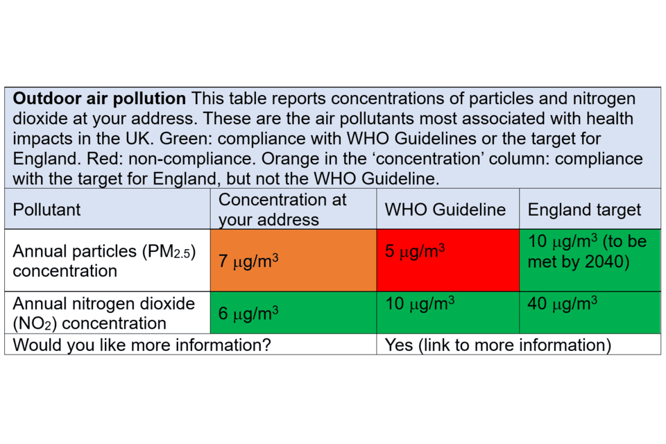
Note: The concentration of an air pollutant (for example, particles or nitrogen dioxide) is given in micrograms (μg) (which is one-millionth of a gram) per cubic meter of air (m3), this is written in shorthand as µg/m3.
Description of Figure 3
Figure 3 shows an updated version of the Outdoor Air Pollution section within the Long-term air quality statement. This table reports concentrations of particles and nitrogen dioxide at your address. These are the air pollutants most associated with health impacts in the UK. The table includes 2 different types of pollutant, annual particles (PM2.5) and annual nitrogen dioxide (NO2). There are 3 columns which report firstly, a concentration of each pollutant at your address, second, a comparison with the WHO guideline and third, compliance with the air pollution target for England. Each box is colour coded: Green, compliance with WHO Guidelines or the target for England. Red, non-compliance. Orange in the ‘concentration’ column, compliance with the target for England, but not the WHO Guideline.
There is a box at the bottom of Figure 3 where a link can be added to provide more information to the reader.
An alternative proposal to presenting outdoor air pollution information
It has been suggested to use a more visual scale, at least as an entry point to the Long-term Air Quality Statement. The benefits of a simple visual display are that they would have an immediate visual impact in a way that a set of tabulated numbers does not, and could convey information to a broader audience, expert and non-expert alike. However, Section 1 of this paper concluded against development of a simplified scale for the following reasons.
Option 4: reporting annual concentration values (as Option 3) with an additional ‘risk scale’. Any such risk scale would be arbitrary. The instant impact of such a scale is far less important for a long-term indicator than for the DAQI.
Option 6: Conversion to a scale using WHO Air Quality Guideline (AQG) levels. The fact that the scale suggested (Figure 1) has 13 points obscures the fact that it is very coarse for individual pollutants, especially PM2.5. Amalgamation of data across pollutants implicitly introduces a weighting system that is not adequately justified.
The difficulties in understanding the original proposal reported by the Verian Panel, however, indicate that it is worth reconsidering this idea. Three options are considered below, the first is a suggestion arising from work commissioned for the AQIS Steering Group, the second from the UN’s BreatheLife campaign, and third a suggestion made here that is more tailored to UK and local conditions.
Verian example of an air quality meter
The following illustration (Figure 4) is a mock-up of air pollution information, provided by Verian to participants in the qualitative research panel. This was a suggestion for what air quality information pages could show, linked to the WHO Air Quality Guidelines.
Figure 4. Air quality meter as part of a mock-up presented by Verian to participants in the qualitative research panel

Image reproduced with permission by Defra (Defra, Verian (2024) Air quality qualitative research panel).
Figure 4 explanatory text
Air quality meter showing a coloured air quality scale from green, which represents air quality has met WHO guidelines, to red, which represents a severe exceedance of WHO guidelines. The arrow points to the colours in the style of an odometer. The text at the bottom of the odometer states whether air pollution at a given address is meeting or exceeding WHO guidelines.
Adoption of the scale shown in this example would require that the following questions are answered:
- what constitutes ‘severe exceedance’ of WHO guidelines?
- whether the WHO Guidelines should be used as the main reference (or at all), or whether this role should be filled by the UK standards?
- how could data be amalgamated across pollutants if it is considered necessary to provide information for more than one pollutant?
On the first of these questions, the WHO Guidelines provide no guidance regarding what constitutes ‘severe’ exceedance. They do provide a basis for a graduated scale via the interim targets on top of the final guideline value for each pollutant, though for PM2.5 in the UK this scale is too coarse. The upper interim targets are more aligned with conditions in countries where particulate pollution is at very high concentrations and not relevant at all to conditions anywhere in the UK at present. Use of the interim targets (Table 1) in the scale would push concentrations towards the left-hand side of the scale which could draw complaints of data manipulation, devising a scale to make the UK look good. The same does not apply to NO2, where the WHO interim targets are in a similar range to UK concentrations.
On the second question regarding the use of the WHO Guidelines, they have particular merit in being based on health concerns only, using peer reviewed data from the scientific literature. The UK standards are less stringent as they consider achievability over given timeframes taking account of the costs and benefits of actions that may be taken, the future evolution of technologies and other factors. The Sub-group’s view is that the WHO Guidelines must feature in the information system, given their international role, the in-depth work that established them, and because health concerns will likely be the major reason that most members of the public access the system. Acknowledging, and providing reasons for, the difference between the 2 would be a useful feature of the information system, and could generate a far better informed public debate on the subject. Ignoring the WHO Guidelines would raise difficult questions as to why they were not included.
On the third question, a solution could be to provide data for only one pollutant, though choosing between PM2.5 (with which most health impact is associated) and NO2 (with which most UK exceedances of air quality standards are observed) would be difficult. The simplest solution may be to provide charts for both pollutants individually. Combining data into one chart may be appealing, but for reasons discussed in Section 1 of this paper, it is not easy to do whilst retaining a meaningful result.
UN BreatheLife Campaign
An example already available on the internet comes from the UN’s BreatheLife campaign. Users enter the name of a city on the home page and PM2.5 concentrations are reported in a similar ‘odometer’ format to Figure 4. The colour scale uses blue to represent low concentrations and dark red/black for high concentrations. The concentrations are compared to WHO guidelines, and the scale also presents a percentage of the concentration. For example, for London, the PM2.5 concentration is 12 μg/m3, which is “128% over the safe level”.
The following are noted:
- data are only for PM2.5, no attempt has been made to factor in other pollutants
- annual mean data are reported
- the scale is not linear, with the halfway point at 35 μg/m3 and the maximum at 150 μg/m3
- the maximum concentration on the dial is based on conditions in highly polluted countries, which have not been relevant in the UK for many years
- despite the non-linearity in the scale, the needle for London is in the blue zone at the left hand side, suggestive of good conditions, although it indicates concentrations that are “128% over the safe level”
- reference to a safe level is inappropriate given that none has been identified for the air pollutants of most concern.
A further suggestion tailored to UK or local conditions
Taking the above discussion into account, an air quality meter could be defined as shown in Table 3, with separate meters for PM2.5 and NO2, in preference to a single combined scale given the difficulty in combining data and the scales defined by the following points:
- all options include the WHO Guidelines and UK standards
- option 1 takes current UK maximum concentration (wherever that may be, though this may likely be in Central London) as the upper limit for the scale
- option 2 adds in the UK maximum concentration (again, wherever that may be) in a previous year (for example, 2010 or 2015)
- option 3 uses the concentration at the specified location, or one nearby (for example, the centre of the nearest town or city) in a previous year (for example, 2010 or 2015) as the upper bound for the scale
Table 3: Options for defining the breadth of a scale for reporting long-term concentrations of pollutants
| Reporting metric | Option 1 | Option 2 | Option 3 |
|---|---|---|---|
| WHO Guideline | Yes | No | Yes |
| UK standard | Yes | Yes | Yes |
| Current UK maximum concentration | Yes | Yes | No |
| UK maximum concentration in (for example) 2010 | No | Yes | No |
| Local concentration in (for example) 2010 | No | No | Yes |
Options 1 and 2 provide a scale that would be uniform across the country. Option 3 provides a scale that would change from place to place. If it is considered important to have the same scale everywhere in the country for ease of comparison, UK maximum concentrations would be used (Options 1 or 2). If this is not considered important (people living in places far removed from Central London may question its relevance), reliance on local data for defining the breadth of the scale may be preferable (Option 3). To permit easy comparison across an area it may be appropriate to select a peak concentration from the nearest large town or city, rather than the concentration at the precise site for which data are requested.
Use of data from a previous year is suggested for setting the upper limits of the scale for 2 reasons:
- it provides opportunity to demonstrate how recent legislation has changed pollutant levels, likely for the better in all locations
- given that legislation has brought concentrations of PM and NO2 down, use of data from (for example) 2010 or 2015 should eliminate the risk of the upper end of any scale having to be adjusted upwards after the start year because of meteorological variability
It is suggested that further public insight survey work be carried out to test the communicative powers of a simplified table (similar to Figure 3 here), or some final design for an air quality meter or set of air quality meters.
Source of data
The source of data for the local value of the annual mean would be an important consideration for the provision of a LTAQS; the decision on this is outside the remit of the COMEAP AQIS sub-group. Ideally, the annual mean concentration used in a LTAQS would be spatially very localised, perhaps down to postcode (outcode and incode) resolution. Measurement data cannot deliver this spatial resolution, so a model must be used. The shortcomings of model data (and also of measurement data) are outlined in Section 1 of this paper. This issue regarding the choice of source of data to use is arguably more critical for the LTAQS than for the current DAQI, which only needs to forecast high pollution episodes and the general spatial area over which the high pollution episode will occur.
A more detailed solution for outdoor air pollution information
Some people may want more data than the air quality meter provides, likely the people most interested in air quality. The desire for more data is not unreasonable given the availability of modelled data. A possible solution is to start with a simple indication of concentrations combined with a button asking if more information is required. A series of levels could be offered with information increasing through the series, as shown below.
Level 1
Simple air quality meters or other simple figure
Question: Would you like further information? (move to Level 2)
Level 2
Table (similar to Table 3) showing:
- annual PM2.5 concentration
- annual NO2 concentration
- possibly the addition of previous years’ data
- explanation of units
- information on source of data
- basic information on impacts
- frequently asked questions (for example, why are UK standards different to WHO Guidelines? why might pollution levels increase from year to year?)
Question: Would you like further information? (move to Level 3)
Level 3
Table showing:
- annual concentrations of all pollutants, highlighting exceedances of national limits and WHO guidelines
- data covering 3 or more years
Links to relevant websites, for example:
- UK legislation and supporting consultancy reports
- information on what central government is doing to reduce pollution
- WHO Guidelines
- information on air pollution impacts on health, including COMEAP reports
- Local Authority Air Quality Action Plan
Indoor air pollution
The original version of the LTAQS providing indoor air quality information can be found in Figure 2.
Feedback on this section from the Verian panel was generally positive. Some people simply found it informative to be told that there are problems related to indoor air quality. The list could be tailored to specific locations, for example only asking about radon in radon affected areas.
People indicated that they liked the links to more information. Design criteria for these links (for example, common structure across the indoor air questions, use of plain English) could be informed by the NHS Health A to Z website, which provides advice on a wide range of health issues in a standard format.
The question and link structure gives rise to two or more levels providing increasingly more detail, similar to that suggested above for information on outdoor air pollution.
It is stressed that the list of questions on indoor air pollution shown in Figure 2 has so far been the subject of little consultation. More questions, fewer questions, or even a completely different set of questions could be appropriate. It would be important to liaise with indoor air quality experts to formulate this information.
Further information
The original version on the Air Quality Statement providing further information can be found in Figure 2.
Recognising the comment from the Verian qualitative research panel that some of these texts are likely to be challenging for many readers, a 3-level approach could again be used, featuring an intermediate step that provides short plain English summaries of material (as below).
Level 1:
- list of further information sources
Level 2:
- for each of the sources at level 1, a short (1 page or less) introduction to the material in plain English
Level 3:
- full links to each source
Some of the information here could repeat that already included elsewhere, for example, in Level 3 of outdoor air pollution (above), to make the information more visible.
Summary
Section 2 considers the comments that have been received on the proposals outlined in Section 1. It discusses additional options for the possible development of a system to disseminate information on long term exposure to air pollutants to the public.
The need for simplification of information is recognised to reach all audiences who may want to use it. Possible options include a simplified version of the outdoor air quality table provided previously, or presenting the information air quality ‘meter’. These options are discussed and would benefit from further testing with different audiences before final decisions are taken on the best approach.
Issues discussed relating to design of an air quality meter address the concentration range to be covered and specific break-points that could or should be included in the range. This included WHO Guidelines, UK legal limits and historic concentrations (from, for example, 2010 or 2015).
The paper provides further detail on a possible multi-level structure for the LTAQS, seeking to provide different levels of information for different audiences. It is concluded that the additional complexity of data on the number of exceedances of short-term limits means that it should not be included in the main summary of annual air quality. However, it could perhaps be provided as part of a multi-level information system, for users who would welcome the availability of this more detailed information.
Further work is needed to refine and define the questions for inclusion related to indoor air quality.
References
Aarhus University. 2022 ‘Current air quality in Denmark’ (viewed 12 February 2025)
Asthma and Lung UK. 2022 ‘Levelling Up Lung Health’ (viewed 12 February 2025)
Collins PF and co-authors. ‘Influence of deprivation on health care use, health care costs, and mortality in COPD’ International Journal of Chronic Obstructive Pulmonary Disease, 2018: volume 13, pages 1289 to 1296 (viewed 12 February 2025)
Committee on the Medical Effects of Air Pollutants (COMEAP). 2023 ‘Air pollutants: quantification of associated health effects’ (viewed 12 February 2025)
Department for Environment Food & Rural Affairs. undated-a ‘Air Quality Modelling for Defra’ (viewed 12 February 2025)
Department for Environment Food & Rural Affairs. undated-b ‘Pollution Climate Mapping model’ (viewed 12 February 2025)
Department for Environment Food & Rural Affairs. 2020 ‘Air pollution in the UK 2019’ (viewed 12 February 2025)
Department for Environment Food & Rural Affairs. 2023 ‘The Automatic Urban Rural Network’ (viewed 12 February 2025)
Department of Labour Inspection, Ministry of Labour and Social Insurance. 2022 ‘Air quality in Cyprus’ (viewed 12 February 2025)
Environment Agency and Joint Air Quality Unit. 2020 ‘UK Urban NO2 Network Annual Report 2020’ (viewed 12 February 2025)
Harrison RM and co-authors. ‘Processes affecting concentrations of fine particulate matter (PM2.5) in the UK atmosphere’ Atmospheric Environment, 2012: volume 46, pages 115 to 124 (viewed 12 February 2025)
Heal MR and co-authors. ‘Biases in the Measurement of Ambient Dioxide (NO2) by Palmes Passive Diffusion Tube: A Review of Current Understanding’ Atmosphere, 2019: volume 10, article 357 (viewed 12 February 2025)
House of Commons Library. 2016 ‘Dementia: age and deprivation differences’ (viewed 12 February 2025)
Lewis AC and co-authors. ‘Evaluating the performance of low cost sensors for air pollution research’ Faraday Discussions, 2016: volume189 (viewed 12 February 2025)
Ministry for Housing, Communities & Local Government. 2019 ‘English Indices of Deprivation’ (viewed 12 February 2025)
Office for National Statistics. 2021. ‘Health state life expectancies by national deprivation deciles, England: 2017 to 2019’ (viewed 12 February 2025)
Rabl A and co-authors. 2014 ‘How Much Is Clean Air Worth?’ Cambridge University Press (viewed 12 February 2025)
Royal College of Paediatrics (RCP) and Child Health and the Royal College of Physicians (RCPCH). 2020 ‘The inside story: Health effects of indoor air quality on children and young people’ (viewed 12 February 2025)
Unwin N. undated ‘Socio economic position, the risk of pre and type 2 diabetes, and implications for prevention’ National Institute for Health and Care Excellence UK (viewed 12 February 2025)
Weir N and co-authors. 2021. ‘Study of the Relationship Between Social Deprivation and Outcome After Stroke’ Stroke, 2021: volume 36, number 4 (viewed 12 February 2025)
World Health Organization. 2021 ‘WHO global air quality guidelines: particulate matter (PM2.5 and PM10), ozone, nitrogen dioxide, sulfur dioxide and carbon monoxide’ (viewed 12 February 2025)