How to present your policies map
Recommended standards for local plan policies maps including categorising policies, what themes to use, and what visual elements and symbology styles to apply.
Applies to England
Local plans must be accompanied by a policies map
Local plans must be accompanied by a policies map, which shows how all of a local planning authority’s (LPA’s) development policies apply to different geographical areas.
Recommended visual standards
This page sets out visual standards that we recommend LPAs follow when creating policies maps.
It’s aimed at those creating the maps - which may be planners, GIS specialists or people working for mapping software companies. We’ve created them through research and testing with LPAs and property technology suppliers.
If all LPAs follow a consistent format for policies maps, this will mean:
- maps are quicker and easier to produce, and there’s less duplication of effort by LPAs each creating their own style and format
- maps are easier to understand and more accessible for people viewing them
- it’s easier to compare maps from different authorities
- it’s moving towards creating a clear national view of planning policies
About these recommendations
These standards are not required - they are recommendations. If they do not work for your LPA, or do not cover something you need to show on your map, you can still ultimately decide how to present your map.
The standards relate to types of policies included within local plans - they do not specifically cover other policies which may be included in the development plan for an area, for example, minerals and waste policies. However, if you’re creating a policies map that illustrates these other types of policies, you can choose to follow any elements which you find relevant.
Standards for policies maps may be mandated in future as part of future planning reforms, for plans produced under the Planning and Compulsory Purchase Act 2004 as amended by the LURA 2023. We’ll update this page when more information is available.
We welcome your feedback on these recommendations – particularly on how they work in practice for you. You can leave feedback at the bottom of the page.
Basemaps
Choose from the 2 options below to set as your default basemap. This is the map that users will see first as they open your map.
A basemap needs to be an effective backdrop for your data. These 2 basemap styles are generally easiest for your users to see your policies when they’re layered on top, due to their visual simplicity and monochrome colour schemes.
Both default map options we recommend below are Ordnance Survey (OS) maps. This is in line with the requirement in law for adopted policies maps to be “comprised of, or contain, a map which must be reproduced from, or based on, an Ordnance Survey map”.
This is set out in regulation 9(1)(a) of the Town and Country Planning (Local Planning) (England) Regulations 2012/767 (“the 2012 Regulations”). “Ordnance Survey map” is defined in Regulation 2. In preparing your policies map, you must satisfy yourself that you are complying with the requirements of regulation 9.
Default option 1: OS Open Greyscale with Labels
A greyscale street view is a familiar view to most users. The street names help users understand and navigate the map. Generally speaking, the light grey colour means it’s clear to see coloured layers added on top.
We recommend using the OS Open Greyscale with Labels map, available through the OS Maps API.
Alternatively, you could use a similar light grey map with street names, but this would ideally look as close as possible to the screenshot below.
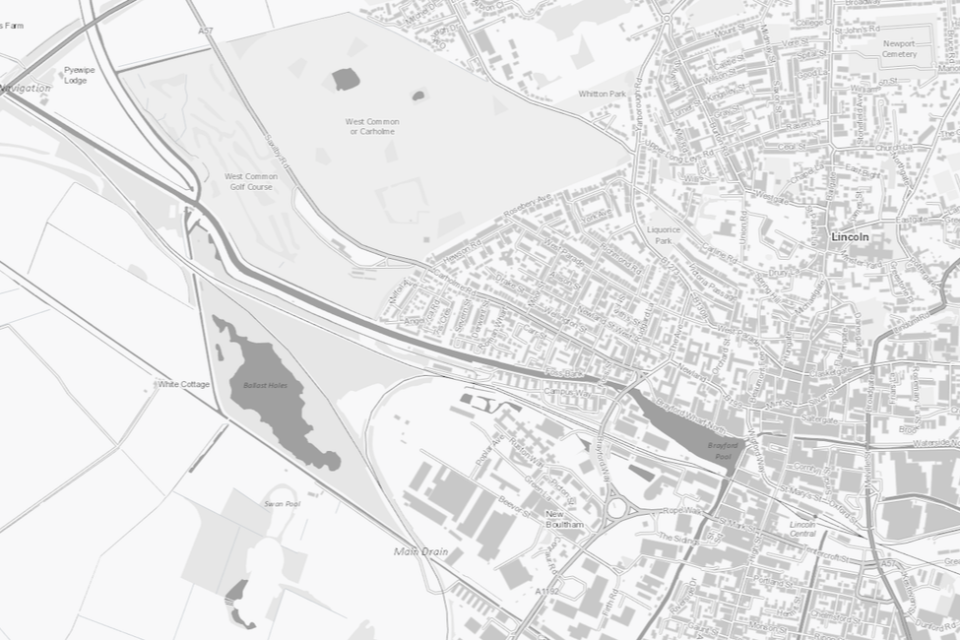
Basemap: OS Open Greyscale with labels. Image provided by Esri UK. Contains OS data © Crown copyright and database right 2024.
Default option 2: OS MasterMap Topography Layer
A mastermap shows a more detailed view that includes land boundaries. This type of map is particularly useful for those who want to see exactly how policies apply to individual sites, for example, to help them prepare a planning application.
Generally speaking, the black and white colours mean it’s clear to see coloured layers added on top of the map.
We recommend using the OS MasterMap Topography Layer, available through the OS Maps API for those with a public sector licence.
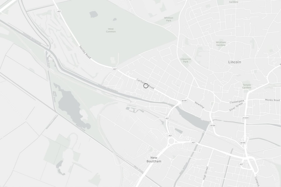
Basemap: OS MasterMap Topography Layer. Image provided by Esri UK. © Esri Community Maps Contributors, Esri UK, Esri, TomTom, Garmin, Foursquare, GeoTechnologies, Inc, METI/NASA, USGS.
Making more options available
If you’re preparing an interactive policies map, you may have more basemap options available to you within the software.
As set out above, your adopted policies map must (at least) contain a map of your area which is reproduced from, or based on, an OS map. Your map must also comply with the other requirements of regulation 9(1) of the 2012 Regulations.
However, you’re welcome to include additional basemaps in your adopted policies map. This will give users more options to choose from and let them select a basemap which best fits their preferences.
Recommended additional option: aerial photography
Aerial photography can bring the map to life and help users see detail that cannot be shown on traditional lined maps.
We do not recommend you use aerial photography as a replacement for the greyscale street view or mastermap. This is because it can be harder to see layers on top, due to the level of detail and different colours.
There are other issues to be aware of when using aerial photography:
- it’s less suitable for physical maps because of the cost and the amount of ink you need when printing and photocopying it
- it’s not always up to date
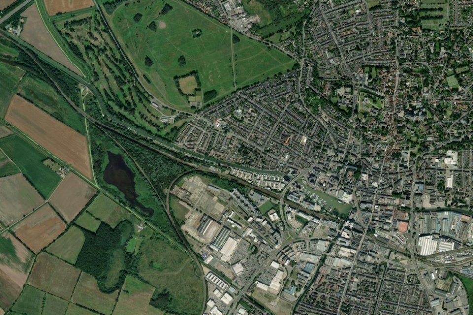
Basemap: aerial photography. Image provided by Esri UK. © Esri, Intermap, NASA, NGA, USGS | Esri UK, Esri, TomTom, Garmin, Foursquare, GeoTechnologies, Inc, METI/NASA, USGS | Earthstar Geographics
Policy categories
We recommend dividing your policies into 3 different categories and using different methods to show each category on your map. Below are the categories we recommend you use and how to show each one.
If you can, include the description as well as the category name so that everyone can understand what the categories mean.
Site allocations
Description: land identified for development for a particular use, for example, housing and employment.
How to show them: use diagonal hatching with a minimum border width of 2 pixels to show site allocations on the map. The colour to use will depend on the policy theme, which we’ll set out later.
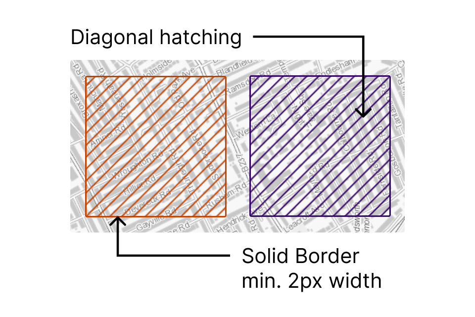
Broader area-based policies
Description: policies based around a broad geographical area, designation, or policy theme. For example, a primary shopping area.
How to show them: use a colour fill at 80% transparency with a minimum border width of 2 pixels to show broader area-based policies on the map. The colour to use will depend on the policy theme, which we’ll set out later.
Authority-wide policies
Description: policies that apply to the whole plan area, for example, affordable housing and housing mix policies.
How to show them: You need to include a reference to these on the map, so that users can find all the policies that may apply to a site. You can choose how to do this.
An example might be a text box that includes a list of all authority-wide policies, and an explanation that they apply to the whole area. The colour of the fill will be dependent on which of the themes the policy falls within.
Policy themes
We recommend that you group your policies into the following 8 themes and allocate the relevant colour to each theme.
You might not need to use all 8 themes if you do not have policies that fit each one.
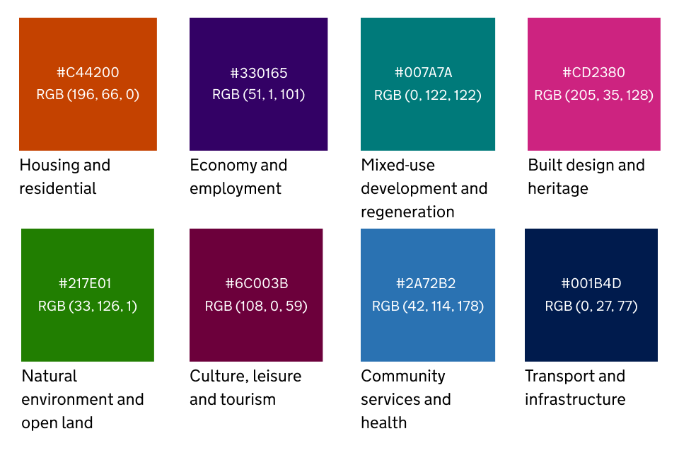
Below we’ve set out the codes for each theme, as well as some examples of which types of policies you could put into each theme.
You do not need to have the exact policies we’ve given as examples
The examples are to help you understand what we mean by each theme and map your policies to them.
You do not need to use all these themes or have these specific policies - use your judgement to name your policies whatever works best for your plan and group them in ways that make the most sense.
Housing and residential
Colours:
-
Hex code #c44200
-
RGB (196, 66, 0)
Examples of policies to group under this theme:
-
Housing-led developments
-
Gypsy and Traveller sites
-
Elderly care
-
Houses in multiple occupation
-
Student accommodation
Economy and employment
Colours:
-
Hex code #330165
-
RGB (51, 1, 101)
Examples of policies to group under this theme:
-
Retaining land for employment uses
-
Employment land allocations, for example, industrial or storage and distribution
-
Retail centre hierarchy
Mixed-use development and regeneration
Colours:
-
Hex code #007A7A
-
RGB (0, 122, 122)
Examples of policies to group under this theme:
-
Mixed-use developments
-
Growth zones or areas of opportunity
-
Strategic regeneration areas
-
New settlements or major urban extensions
This is intended to cover areas of change with a variety of uses, like Kings Cross or Plymouth waterfront.
If a site allocation or development includes a mix of uses, you could choose to group that under the theme for the predominant use. For example, you could put commercial-led mixed-use developments in the ‘Economy’ theme.
Built design and heritage
Colours:
-
Hex code #CD2380
-
RGB (205, 35, 128)
Examples of policies to group under this theme:
-
Design (you could point to a supplementary planning document or design code if they set out useful further detail)
-
Historic environment, for example, conservation areas and locally listed buildings
-
Tall buildings
Natural environment and open land
Colours:
-
Hex code #217E01
-
RGB (33, 126, 1)
Examples of policies to group under this theme:
-
Flood risk
-
Biodiversity
-
Countryside
-
Protection of species and habitats
-
Green Belt
-
National Landscapes
Culture, leisure and tourism
Colours:
-
Hex code #6C003B
-
RGB (108, 0, 59)
Examples of policies to group under this theme:
-
Tourism development
-
Art and culture
-
Sports and recreation
Community services and health
Colours:
-
Hex code #2A72B2
-
RGB (42, 114, 178)
Examples of policies to group under this theme:
-
Health facilities
-
Community facilities and assets
-
Provision of open space
Transport and infrastructure
Colours:
-
Hex code #001B4D
-
RGB (0, 27, 77)
Examples of policies to group under this theme:
-
Sustainable travel or transport management
-
Blue and green infrastructure
-
Climate change and renewable energy
-
Minerals and waste
Setting up your map to help users navigate it
You must have a version of the policies map that shows all the policies that illustrate the development plan in one place. However, showing all policies on the map at once is often visually overwhelming for users and means it’s hard to focus on the areas they’re most interested in.
Ideally, you would let users filter on an interactive map. We recommend you:
-
set up every policy as a separate layer so your users can choose to show or hide them
-
show more detailed information about each polygon when a user clicks on it
These steps will help users distinguish between different policies that are shown using the same colour.
Or, you could have additional versions of the map that show different policies.
Accessibility
You need to make your map as accessible as possible so that disabled people and people with other access needs can get the information they’re entitled to. You need to be comfortable that you’re compliant with your legal obligations around accessibility as set out in the Equality Act 2010.
Here are some non-exhaustive examples of what you could do.
Keep colour accessibility in mind
Each colour we’ve chosen contrasts well enough with the grayscale basemap above with no transparency applied (for example, the borders of all areas). This means they contrast well enough with the background map to be distinguishable. This meets the colour contrast ratio recommended by the Web Content Accessibility Guidelines.
The colours chosen also contrast well enough when placed alongside each other in pairs. Bear in mind that the colours will get less accessible when you place multiple colours alongside each other or overlap them.
If you need to add any other coloured elements to your map, run your choices through a colour contrast checker to check they stand out against your basemap.
Give users options for how to display the map
If you’re using an interactive map, you could:
-
let users select only the layers they want to see
-
let users select the basemap they want to use
-
check how well your map works with assistive technologies and accessibility software, like screenreaders and tools that let users change the text size or colours
-
make your attribute data downloadable as well as available on the map itself
Have alternative formats available
Make the policies map more accessible by making it available in multiple formats.
For example, not everyone will be able to use an interactive map. You must not exclude anyone because of this. You could also make available:
-
a static version of the map, like a downloadable image or PDF, for those who cannot use interactive online software
-
a way of seeing the map for those who cannot access the internet independently
Likewise, not everyone will be able to use a static map - particularly those who are visually impaired.
Share your feedback
If you implement these standards, we’d like to hear your feedback and any suggestions for improvement. You can share your thoughts at digitalplanningteam@communities.gov.uk